Neither has been made public yet, so I'm only showing close-up snippets for now.
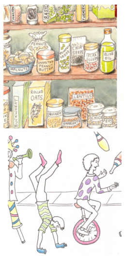
The one on top is to do with healthy food choices. I decided to place all the food items on shelves in a pantry (oh how I'd love to have such a thing myself), so I needed to work out how they would be grouped sensibly in real life--in other words, not have the cinnamon next to the avocado next to the rice--but also look interesting graphically. A few drafts later, all was in order.
But too many things in storage jars looked boring, so some items were left in bags or boxes, or put in bowls, or presented in their natural form alongside the jars. But then all had to be named, as this is being produced for information, and I tried first putting labels on the shelves like they would be in a shop. That looked all wrong! It made more sense to let the packaging naturally identify the contents, and jars could have labels stuck on; that fit better and looked more normal. Then it was just to add subtle watercolour. Job done, and happy client!
At the same time, I was also finishing up a very different project, which included a sort of carnival-type procession. It was quite fun coming up with the various figures and trying to give them happy active movement. The brief called for an uncluttered black and white comic across a long single panel... but with added touches of colour, most unusual. I used coloured pencils for this, in a slightly sketchy sort of way, as if someone had just started colouring it. Filling in too-perfect solid blocks of colour might've seemed at odds with the overall black and white style, and left the viewer wondering why it wasn't "finished"?
But what made this one especially tricky is this: knowing that it's going to be blown up to billboard size, and therefore every single wobbly line would be terribly obvious! Usually it's the other way round, and things always look neater and just better when reduced in size. Can't wait to pop up to London in a couple of months and see how it turned out...

