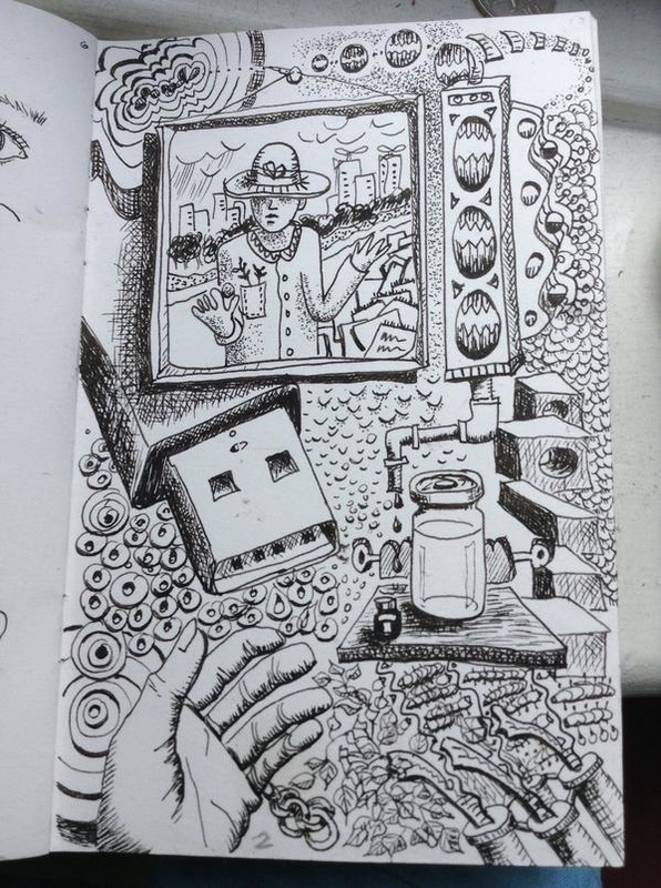
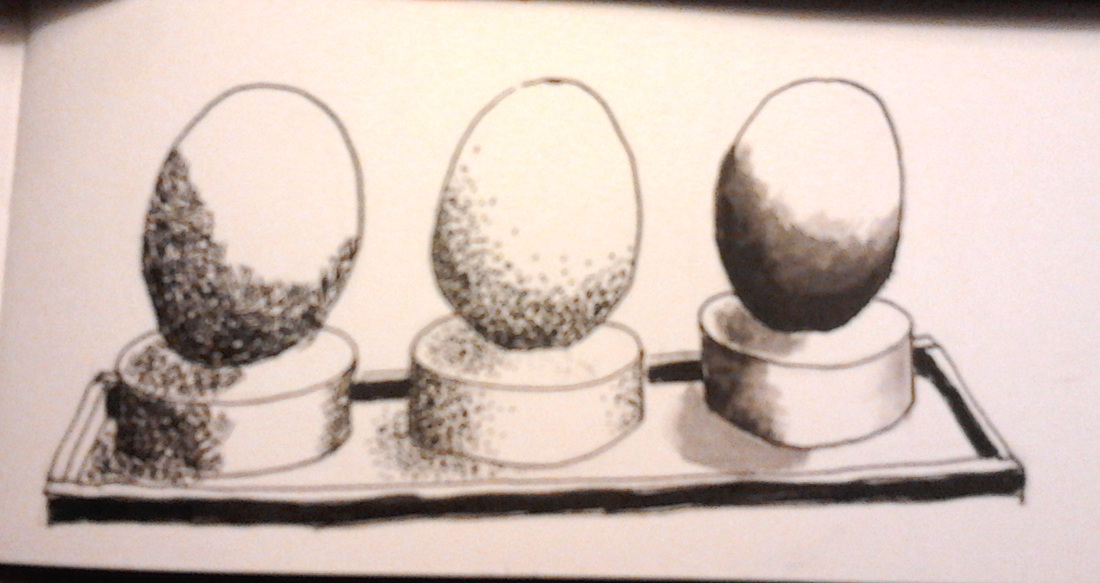
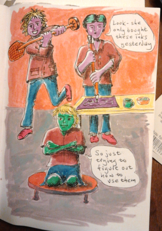
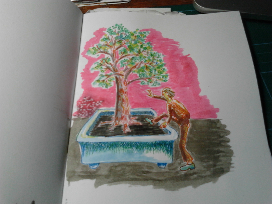
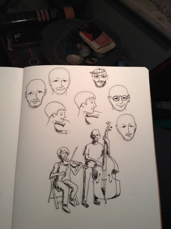
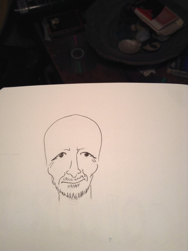
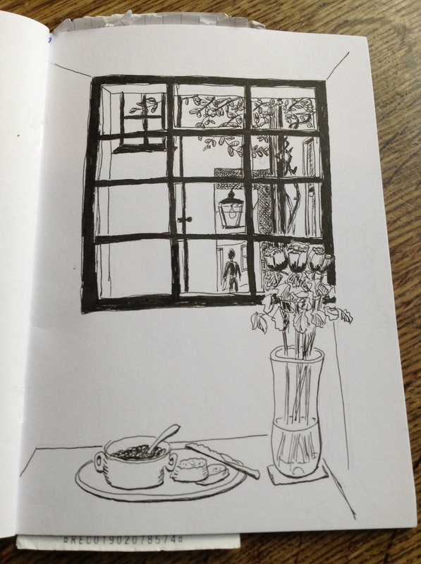
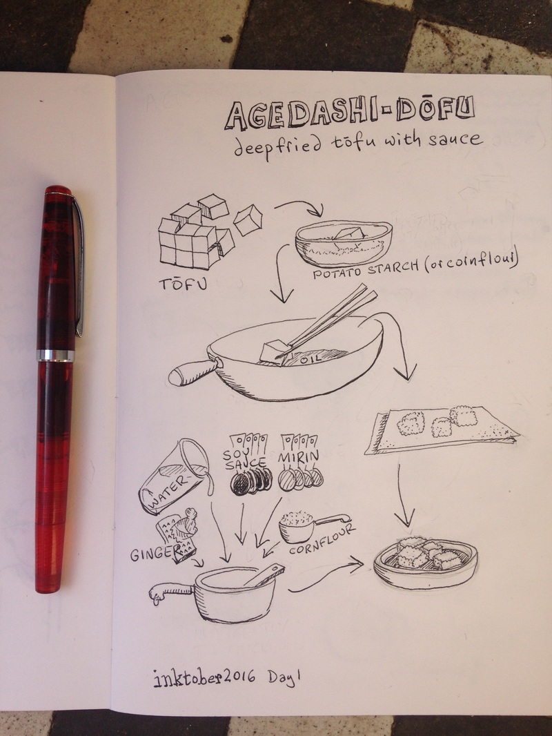
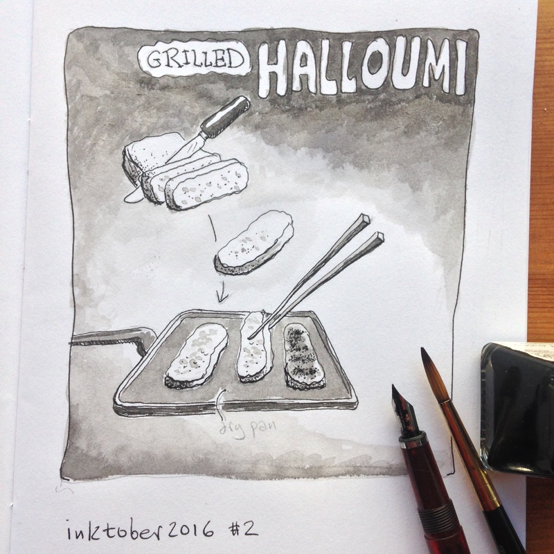
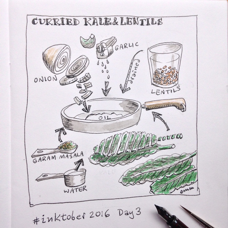
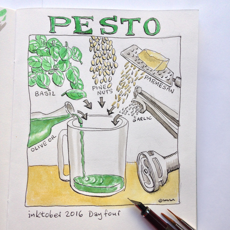
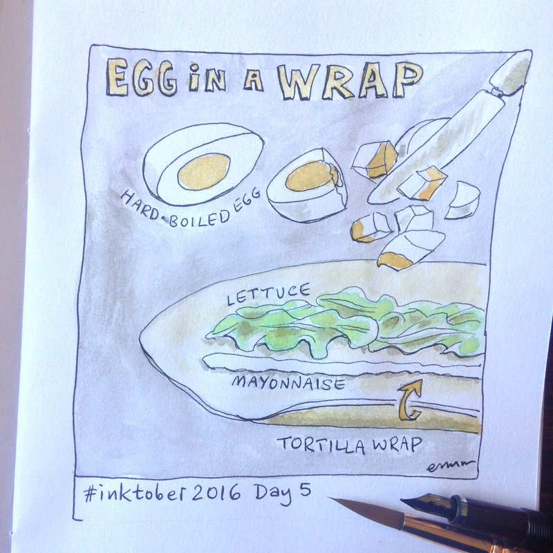
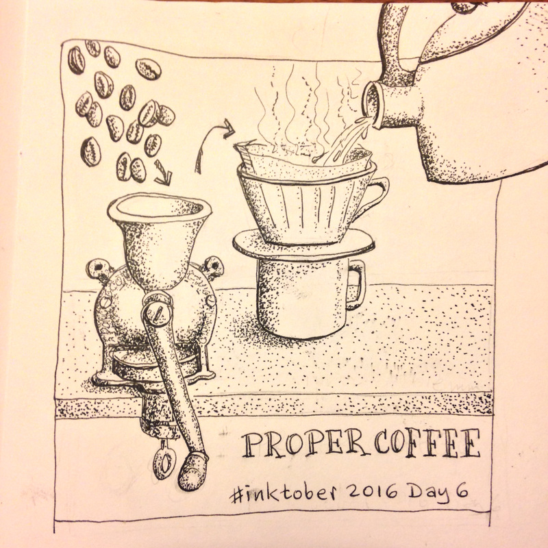
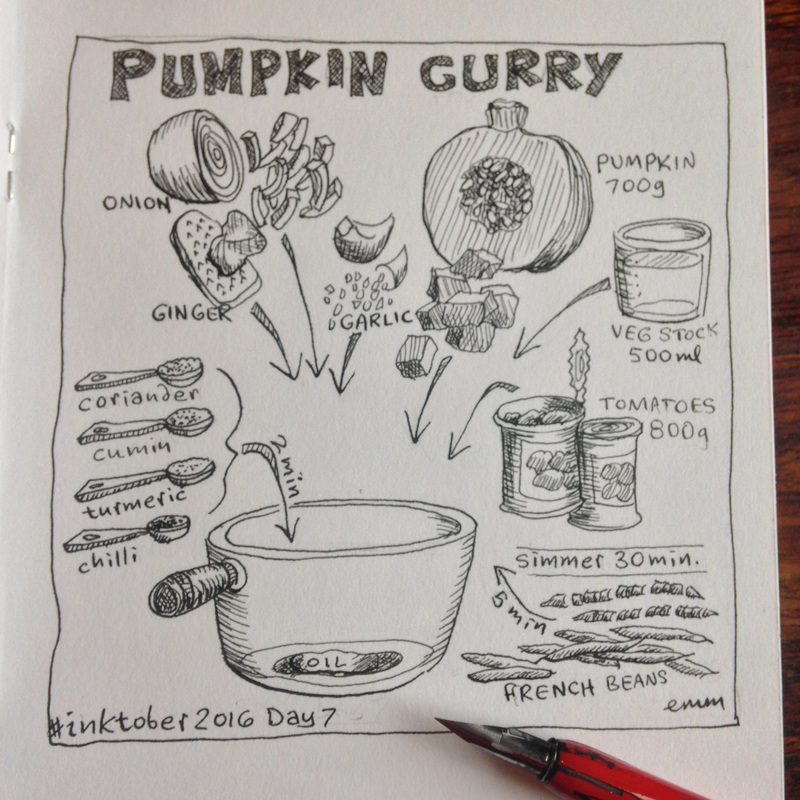
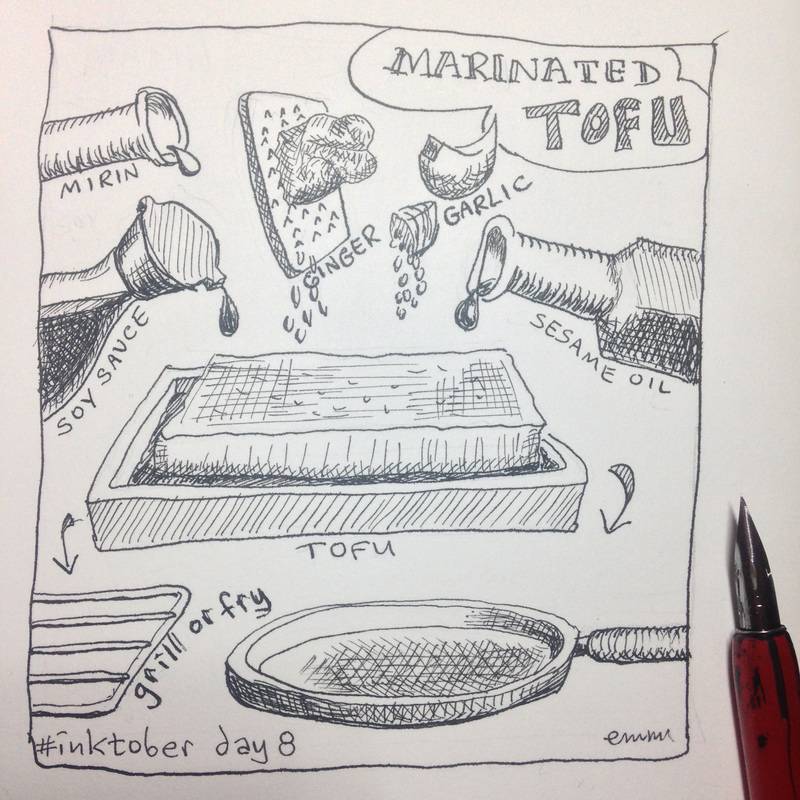
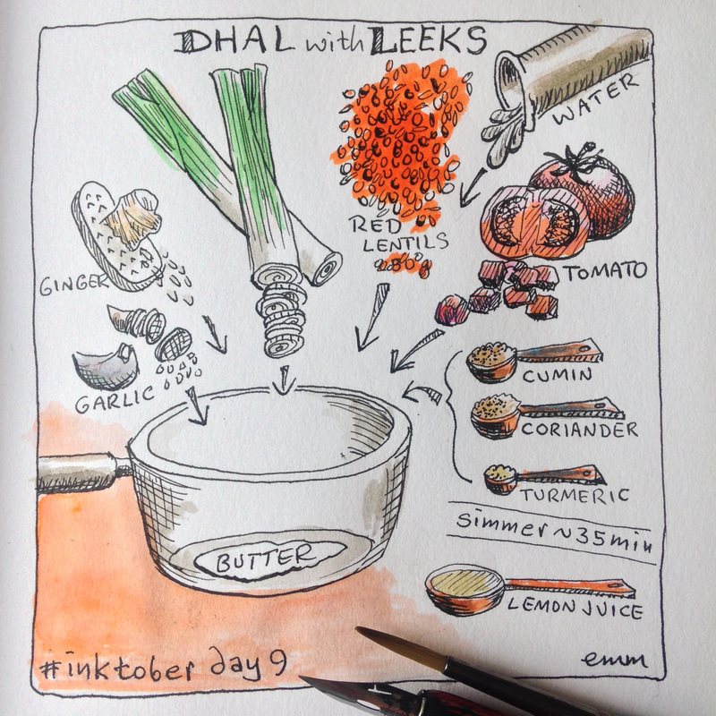
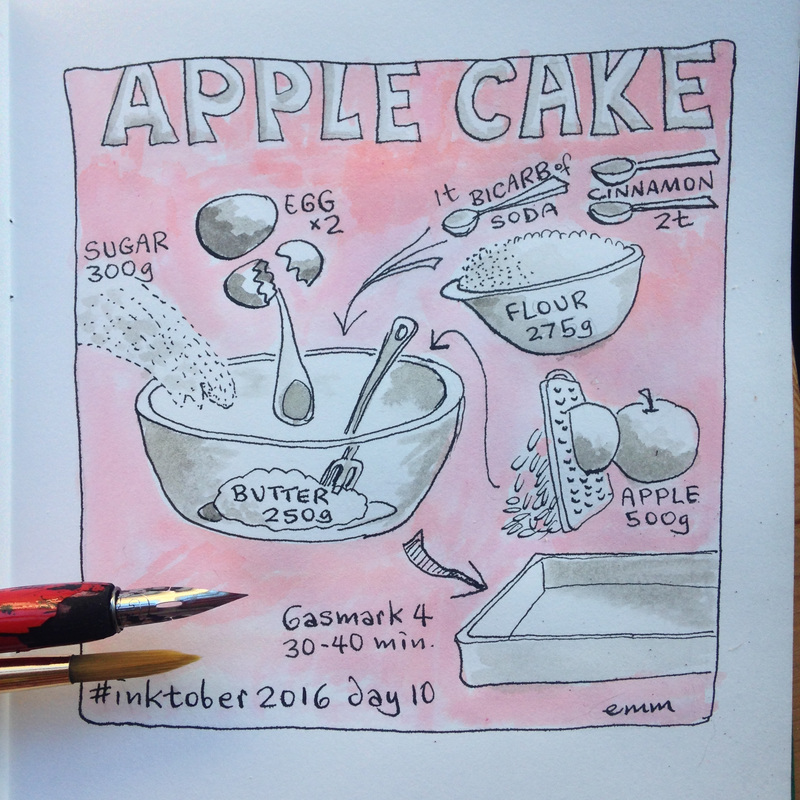
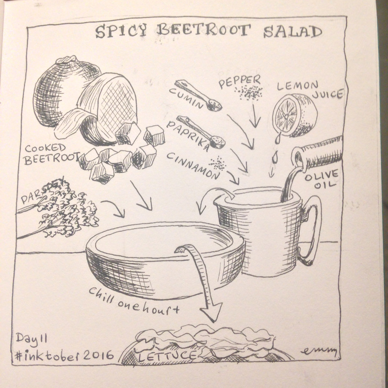
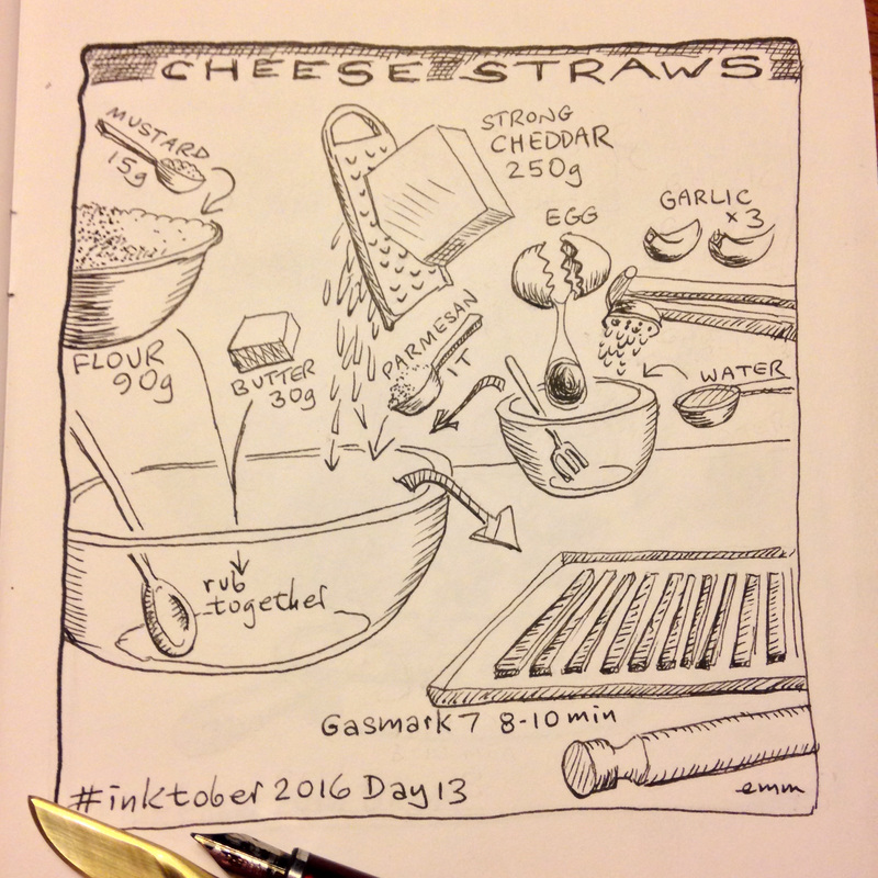
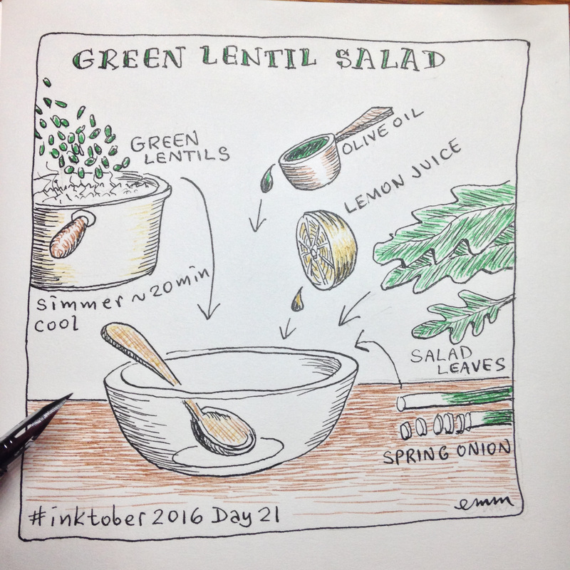
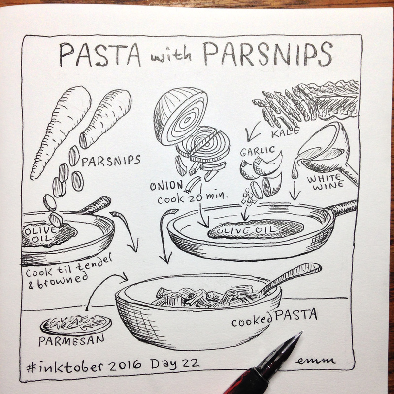
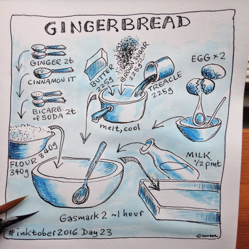
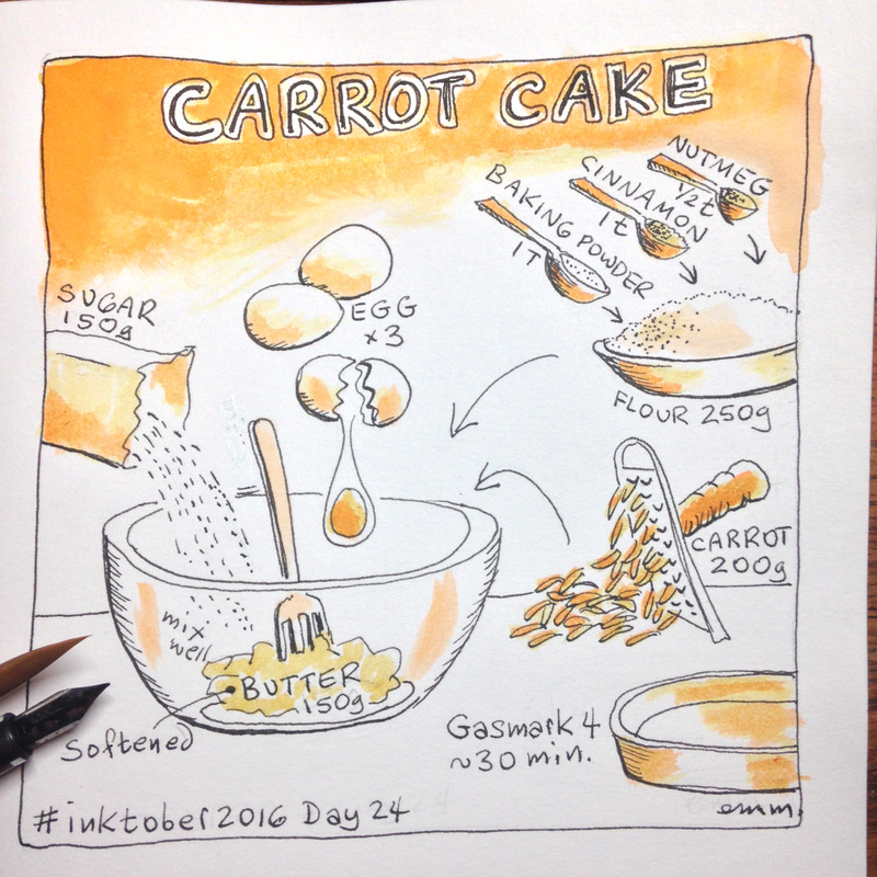
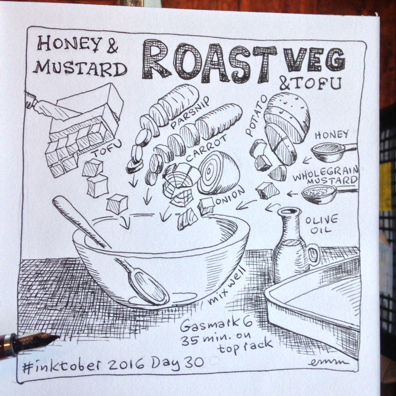
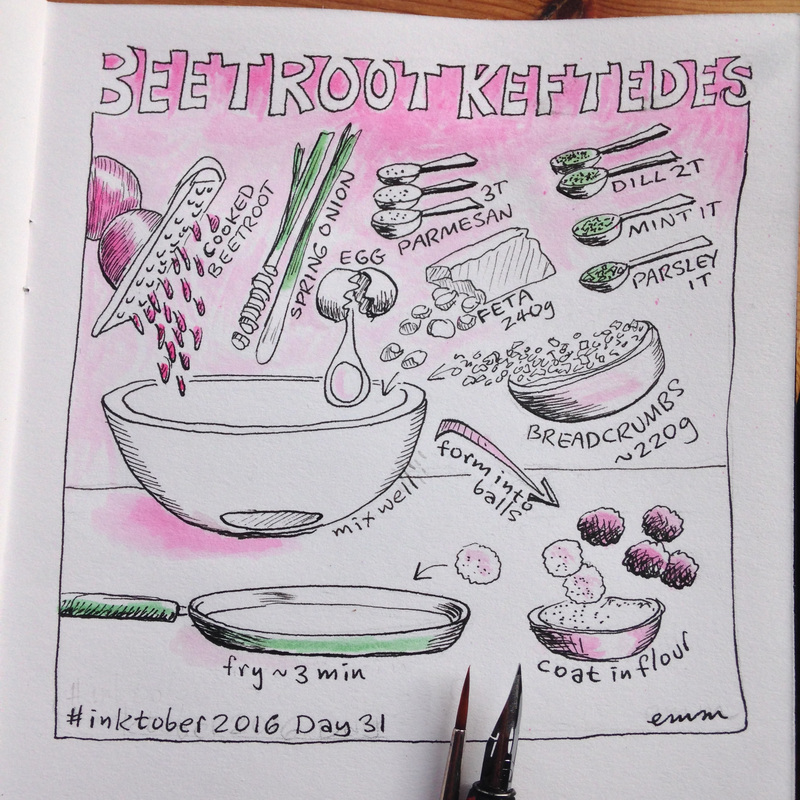
Fountain pen, dip pen, brush pen, brushes.... ink wash, coloured inks, stippling.... the object of the game is to learn to ink better, so that means experimenting, which means some of these are going to be a bit rough!


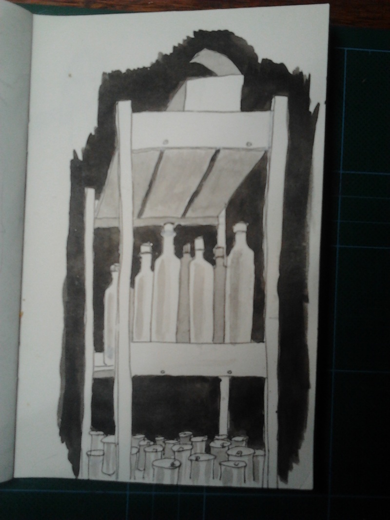
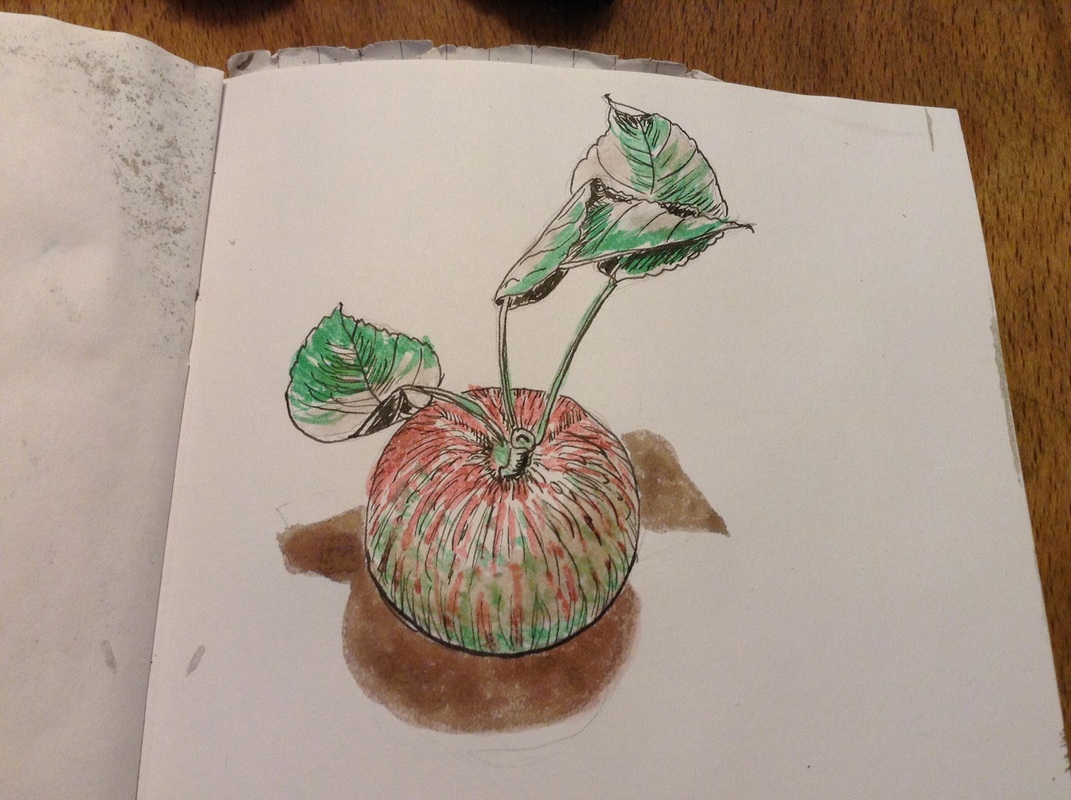
Finished!!
| Michi Mathias. illustration & comics. |
|
|
Fountain pen, dip pen, brush pen, brushes.... ink wash, coloured inks, stippling.... the object of the game is to learn to ink better, so that means experimenting, which means some of these are going to be a bit rough! Finished!!
0 Comments
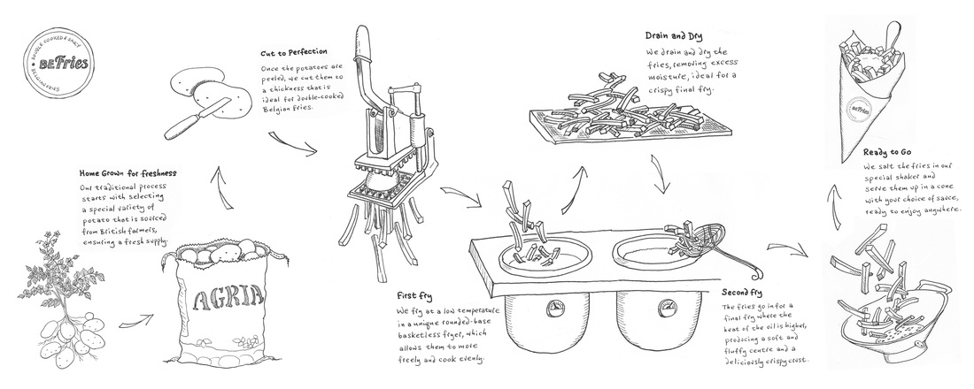 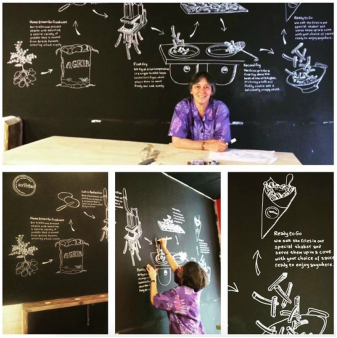 A new Belgian fries restaurant called BeFries which has just opened in Brighton wanted line drawings showing the whole process from potatoes growing to chips in a cone, to be chalked on their blackboard wall three meters wide.
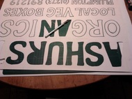
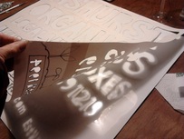
It took some trial and error to get all the elements in reasonable scale relative to each other, and balanced in a way that would flow and make sense with enough spacing including room for the text. It was fun drawing the cool cutting machine (I wanted to write hand-cutting as it's operated by pulling the lever, but that just sounds bad!). The day of the actual chalking involved a projector, with my line drawings changed to pink so I could see where I was, and joining the whole picture up from two halves as it was too wide to project as one image. This was a fun job, working for a lovely bunch of guys making a truly delicious product! 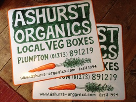 I'd been feeling sad every time I saw my friends' farm delivering their veg boxes from an unmarked white van like some fly-by-night upstart, although they've been working hard at this for over 21 years. Ashurst Organics started up the first box scheme in this area way back when such things were pretty well unknown but their first van, painted with their name and number, had long since failed its MOT and subsequent vans were either short-lived replacements or hire vans, so obviously couldn't have their info painted on. It suddenly occurred to me that I'd seen removable magnetic signs on other vehicles, and maybe I could make them a temporary one they could use for the time being. I found magnetic sheet online, and then began the fun of working out how to do it, as the surface is shiny vinyl which won't even take a pencil mark, nor would most paints adhere well to my little test piece.
The carrot leaves were too tricky to pre-prepare with a stencil, so had to be simply painted straight on with the same thick, unwieldy Hammerite, hoping for the best. Having never done anything like this before, the first strokes were scary and terribly unpromising but the end result turned out decent enough to do for now - whew!
Next will be a big boxful of their luscious veg painted on another panel to go alongside one of these on the back of the van, more a proper illustration than just one carrot. This should be done before the end of the month when deliveries start up again after their very short break. Watch this apace, and if you're not too far from Plumpton you can order your box here! 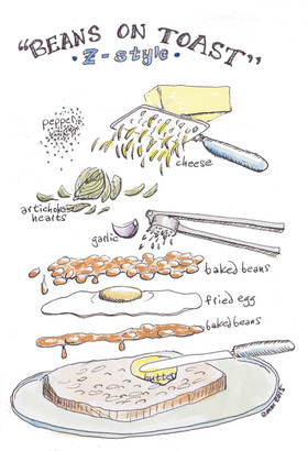 Directions for making beans on toast? How silly and unnecessary is that?
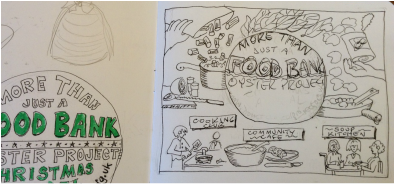
Except that when my son Z says he's making that for breakfast, well, beans are included, and toast is included, but there the resemblance to the normal concept of the dish ends. I should point out that while the graphic recipe pictured here shows what he made the day before yesterday, it is but is one version and other things will be included as and when available. The double layer of baked beans is important. I'd initially neglected to represent the lower one, and was told that was very necessary in order to soak nicely into the bread, hence it's shown as more sauce than bean. The bread is usually a delicious sourdough made locally, but apparently even terrible soft white bread will do. Enjoy! 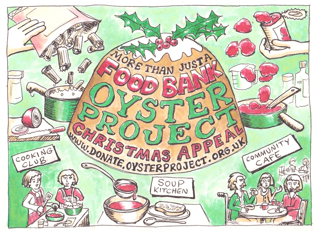 There's a small charity in town, run by and for people with disabilities, which I've been involved with a little over the past few years. For one thing, I'd have lunch every Wednesday at their pop-up community cafe which provides their members with work experience in cooking, serving, operating the till, etc. And I've hosted an art table there for a while, for anyone who wanted to come do some drawing or painting. So when I was asked to create a fundraising ad to appear in our town mag, Viva Lewes, which goes free to many thousands of people, I was delighted to say yes. It had to be half of an A5 page, and be somehow Christmassy for the December issue (which is out now, of course) and be foodbank-focused. Other than that it was up to me, although they did want it hand-drawn, including all the wording, to stand out from the rest.
 The rough sketches were happily approved. But I suddenly realised that a red circle in the centre of a white rectangle would look like.... the flag of Japan! Nothing wrong with Japanese flags, but not exactly what we needed here.
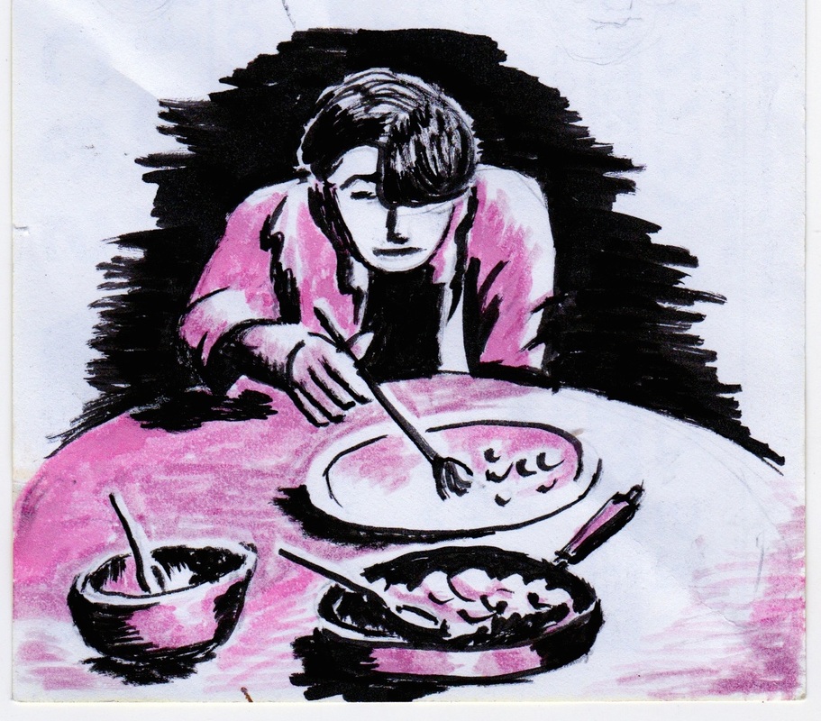
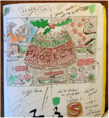
Someone suggested a Christmas pudding instead to hold the wording. It was harder to get the text to fit nice and legibly onto this shape, and as this was in fact the whole point of the exercise, I kept making the pudding base broader until it worked. I thought about using a limited colour palette instead of full-colour, and as brown would now be included I took an earlier draft and tried a lighter shade for the background. It was just too dull. Just to make sure, I experimented with a blue background, which seemed somehow too sky-like, and an orange background, which just didn't make any sense at all. So in the end, I did keep to only red and green and pudding-brown, using darker and lighter shades of each, and leaving as much white as was reasonable, for brightness. In the interests of the "hand-drawn" look it was all done by eye, no rulers or measuring involved but if I were to do it again, I would be a lot more accurate with the lettering! Last I heard, the fundraising was going well, on the way toward the target, and I'm happy to have played a part in that. 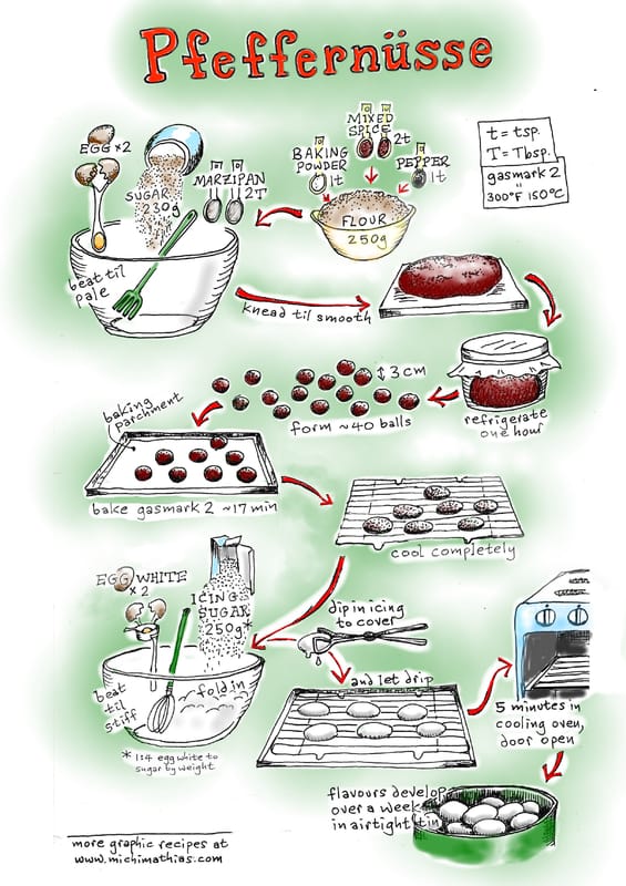 The two good things this time of year are, in my personal opinion a) getting to sing beautiful obscure old unusual Sussex and Sheffield carols in multi-part harmony with various nice groups of people, and b) German spice biscuits. I've been lucky enough to do loads of the singing already, and now it's time to get out the mixing bowl and start baking.
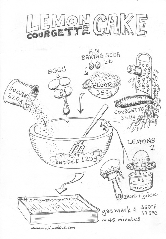
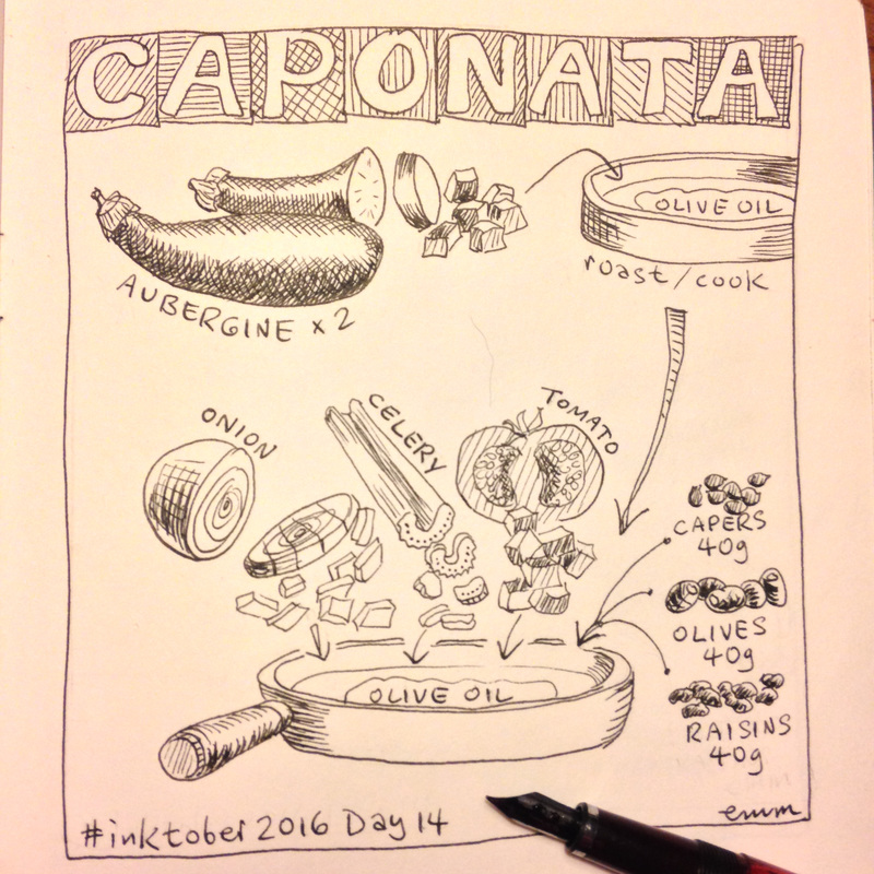
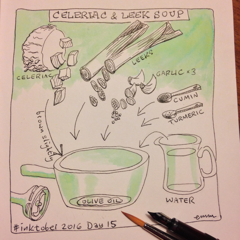
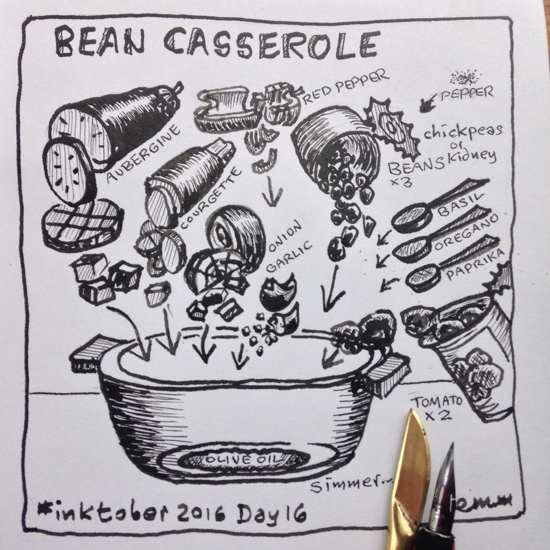
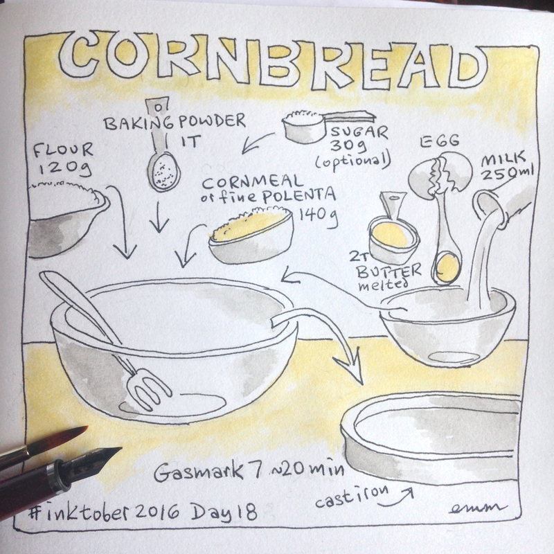
This is a recipe I came across a few years ago in a newspaper and, well, to be honest... it was a bit of a faff, what with letting the icing drip and dry. But they were so delicious and proved very popular - completely worth the trouble. I'm not normally very keen on sugar or refined carbs, so these are just a complete indulgence once a year! As is my way, I naturally sketched out the recipe in graphic form to make it easy to follow for myself, then posted it here a couple of years ago, and even printed it as a postcard. Today I decided to make it look more festive with colour. And you can download it below. Enjoy! On the last day of September I heard that #inktober was starting the very next day. I'd vaguely been aware of this last year, but too late, and too impossible anyway: I'm awfully slow, and really bad at coming up with ideas... So obviously this was going to be hard, but that's a good reason to jump in and do it, isn't it? It's now over halfway through the month and I've very nearly kept up daily, after falling behind by as much as three days in the starting week. These are the first fifteen. Doing this sure does makes one think...
1) Hey, this is waaay more drawing than I usually manage and I can actually do it! 2) It's no good just putting any old thing on paper for the sake of posting something, anything, on time. Though of course nothing wrong with simple - that can be the hardest and the best! Something I've yet to achieve. 3) In the spirit of the originator's purpose of learning to draw better, it seems right to try things that might not work, different techniques and tools, deliberately experimenting with ways I don't usually draw: straight to ink with no pencilling, only brush with no outline, in public... 4) However, knowing that I've got to then post the output starts to inhibit me, and I have to overcome that fear of making bad art. Nothing to say one couldn't start one over, I guess, but then would I ever finish? Part of this for me is a desire to suppress perfectionism, which always holds me back. 5) But looking at others' work at the hashtag can be quite intimidating! A lot of incredibly detailed, complex, amazing artwork out there. The idea is to take inspiration, not to compare. 6) I think I am getting quicker at this. Not necessarily a result of inktober itself, but I'm noticing that I'm not as slow as I used to be. Who would have thought it - practice works! Perhaps there will be more learnings by the end, on 31 October. And I wonder if I will miss it when it's over. 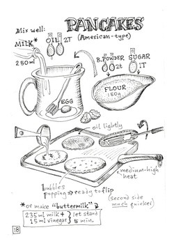 Well, it's Shrove Tuesday today, and it's taken me by surprise once again as it's just not part of my consciousness. To be perfectly honest, it's hard to understand why it continues in a time when we don't all give up butter and eggs and milk for the following forty days. So we don't need to use up those perishables, and we don't need to enjoy a rich fatty blowout before log weeks of abstinence.
However, just in case people are playing the game, and are thinking of making pancakes today -- and why not? They're delicious and versatile any day of the year -- may I take this opportunity to mention my rather nice recipe if you're happy with the lighter, baking-powder-risen American version. Do let me know if you have any favourite variations or ways of using them. And if you'd like to know about new recipes as they're created, please do sign up to my rather infrequent newsletter over there at the right. ==> ==> ==> ==> ==>
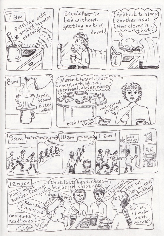
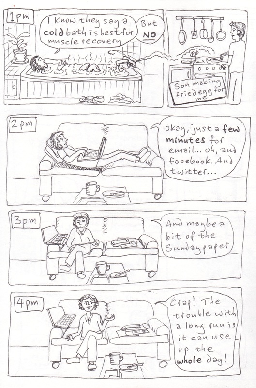
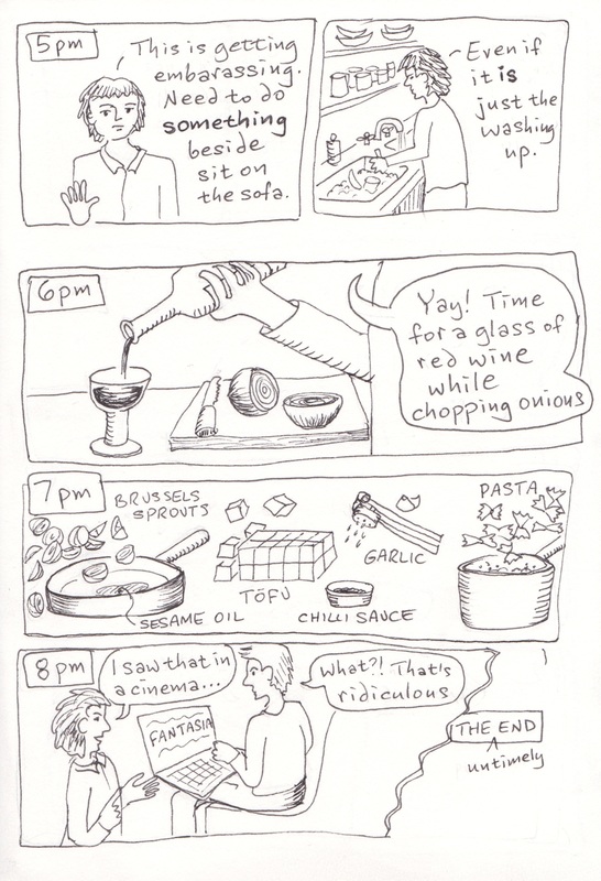
So there was this thing called Hourly Comic Day on 1st February. In February last year, I had yet to have drawn even one single comic, but this time I heard about it somehow and thought I'd have a go. The idea, as far as I understand, is simple: one draws something about one's real life for every hour of being awake on the day. Lots of people post these hourlies on twitter throughout the day. I didn't as I was mostly playing catch-up, for obvious reasons, but I'm not even sure if this is "allowed" or should we be completing each hour within the actual hour...?
Anyway, given that the Day in question was a Sunday, and therefore included a non-negotiable long run (six weeks from the end of marathon training), three of the hours were all about running, and the ones before that were about getting ready for the run, and a few after that were about recovering from said run. So not the most interesting of days, and not the most drawable on the spot, either! And I'm afraid I simply ran out of time and/or out of energy in the evening.... still inking earlier hours, trying to catch up... so it all ends abruptly after 8pm. But what a fun idea! It seems to take place on 1 Feb every year, so could be any day of the week; next year that date falls on a Monday which should be a day with more variety in it! It's easier to see the whole lot over on tumblr Note: 17-year-old son wishes to make it clear that the brussels sprouts at 7pm were in fact peeled and cut by him, not by me as he thinks this implies. 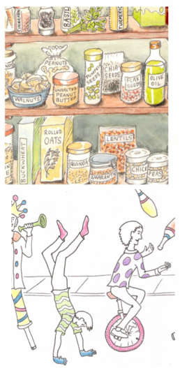 It wasn't the most relaxed of holiday seasons this year, as two deadlines for illustration jobs happened to fall right around then. But that's okay, as Christmas is just another day really [see previous blog post] and anyway this was a situation of my own making [see earlier post on procrastination!]. Both of these were fun jobs, for people I like working with.
Neither has been made public yet, so I'm only showing close-up snippets for now. The one on top is to do with healthy food choices. I decided to place all the food items on shelves in a pantry (oh how I'd love to have such a thing myself), so I needed to work out how they would be grouped sensibly in real life--in other words, not have the cinnamon next to the avocado next to the rice--but also look interesting graphically. A few drafts later, all was in order. But too many things in storage jars looked boring, so some items were left in bags or boxes, or put in bowls, or presented in their natural form alongside the jars. But then all had to be named, as this is being produced for information, and I tried first putting labels on the shelves like they would be in a shop. That looked all wrong! It made more sense to let the packaging naturally identify the contents, and jars could have labels stuck on; that fit better and looked more normal. Then it was just to add subtle watercolour. Job done, and happy client! At the same time, I was also finishing up a very different project, which included a sort of carnival-type procession. It was quite fun coming up with the various figures and trying to give them happy active movement. The brief called for an uncluttered black and white comic across a long single panel... but with added touches of colour, most unusual. I used coloured pencils for this, in a slightly sketchy sort of way, as if someone had just started colouring it. Filling in too-perfect solid blocks of colour might've seemed at odds with the overall black and white style, and left the viewer wondering why it wasn't "finished"? But what made this one especially tricky is this: knowing that it's going to be blown up to billboard size, and therefore every single wobbly line would be terribly obvious! Usually it's the other way round, and things always look neater and just better when reduced in size. Can't wait to pop up to London in a couple of months and see how it turned out... |
Click to see: What am I doing right NOW?
=================== Note: Two Shillings per Day graphic novel-related posts now appear over here on their own page. 
Categories
All
Archives
February 2018
|
|

|
|