Michi Mathias. illustration & comics.
  • home
  • about
    • now
    • interviews
  • DIY Vegan Cooking
  • Two Shillings
    • synopsis
  • comics
    • Just a Normal Day?
    • Up, Down or Stay the Same?
  • work with me
  • shop
  • contact

How to make the perfect chips / Belgian fries

6/8/2016

0 Comments

 
Picture
Picture
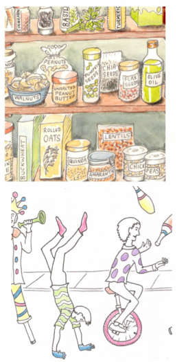
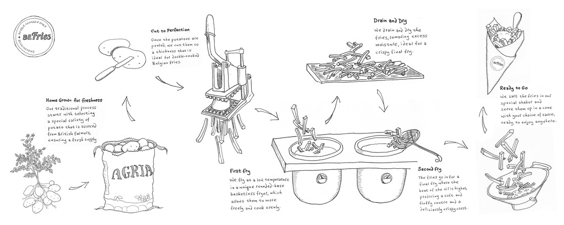
A new Belgian fries restaurant called BeFries which has just opened in Brighton wanted line drawings showing the whole process from potatoes growing to chips in a cone, to be chalked on their blackboard wall three meters wide. 

It took some trial and error to get all the elements in reasonable scale relative to each other, and balanced in a way that would flow and make sense with enough spacing including room for the text. It was fun drawing the cool cutting machine (I wanted to write hand-cutting as it's operated by pulling the lever, but that just sounds bad!).

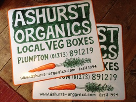
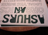
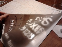
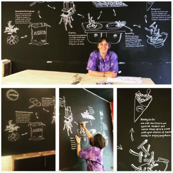
The day of the actual chalking involved a projector, with my line drawings changed to pink so I could see where I was, and joining the whole picture up from two halves as it was too wide to project as one image.  

This was a fun job, working for a lovely bunch of guys making a truly delicious product!

0 Comments

magnetic illustrations

19/1/2016

0 Comments

 
Picture
I'd been feeling sad every time I saw my friends' farm delivering their veg boxes from an unmarked white van like some fly-by-night upstart, although they've been working hard at this for over 21 years. Ashurst Organics started up the first box scheme in this area way back when such things were pretty well unknown but their first van, painted with their name and number, had long since failed its MOT and subsequent vans were either short-lived replacements or hire vans, so obviously couldn't have their info painted on. 

It suddenly occurred to me that I'd seen removable magnetic signs on other vehicles, and maybe I could make them a temporary one they could use for the time being. I found magnetic sheet online, and then began the fun of working out how to do it, as the surface is shiny vinyl which won't even take a pencil mark, nor would most paints adhere well to my little test piece. 

Picture
Picture
So I drew the lettering full-scale on sturdy A3, cut each one out with a knife to make a stencil, laid it on the vinyl and traced inside all of the 77 shapes with a fine-point Sharpie. 

Then it was on with the Hammerite, following my lines by hand with this rather hard-to-work green paint. 
The carrot leaves were too tricky to pre-prepare with a stencil, so had to be simply painted straight on with the same thick, unwieldy Hammerite, hoping for the best. Having never done anything like this before, the first strokes were scary and terribly unpromising but the end result turned out decent enough to do for now - whew! 

​Next will be a big boxful of their luscious veg painted on another panel to go alongside one of these on the back of the van,  more a proper illustration than just one carrot. This should be done before the end of the month when deliveries start up again after their very short break. Watch this apace, and if you're not too far from Plumpton you can order your box here!  
0 Comments

How to have the nicest possible divorce

10/12/2015

0 Comments

 
Picture

​Thankfully this is not something I've had to go through. But I can certainly see that dealing with one of life's most  unpleasant experiences in a way that addresses the difficult negative emotions before trying to agree legal stuff must be a better way!

Jo O'Sullivan is a local lawyer who works in this innovative way, involving the services of a 'family consultant' who interacts with all parties in a number of meetings, making it easier and faster and avoiding having to go to court; in fact that's one of the first things both sides agree on.

Jo wanted a comic-style graphic that would help explain this in a clear, easy-to-understand way. It wasn't one of my quickest, most straightforward jobs with an easy answer - it is, after all, a complex subject. We needed a good few drafts trying out different ways of portraying it, and a bit of trial and error, but in the end doesn't the Collaborative Divorce look like the better choice? 

www.osullivanfamilylaw.com

0 Comments

a couple of nice jobs

13/1/2015

2 Comments

 
Picture
It wasn't the most relaxed of holiday seasons this year, as two deadlines for illustration jobs happened to fall right around then.  But that's okay, as Christmas is just another day really [see previous blog post] and anyway this was a situation of my own making [see earlier post on procrastination!].  Both of these were fun jobs, for people I like working with.  

Neither has been made public yet, so I'm only showing close-up snippets for now. 

The one on top is to do with healthy food choices.  I decided to place all the food items on shelves in a pantry (oh how I'd love to have such a thing myself), so I needed to work out how they would be grouped sensibly in real life--in other words, not have the cinnamon next to the avocado next to the rice--but also look interesting graphically.  A few drafts later,  all was in order.  

But too many things in storage jars looked boring, so some items were left in bags or boxes, or put in bowls, or presented in their natural form alongside the jars.  But then all had to be named, as this is being produced for information, and I tried first putting labels on the shelves like they would be in a shop.  That looked all wrong!  It made more sense to let the packaging naturally identify the contents, and jars could have labels stuck on; that fit better and looked more normal.  Then it was just to add subtle watercolour.  Job done, and happy client!

At the same time, I was also finishing up a very different project, which included a sort of carnival-type procession.  It was quite fun coming up with the various figures and trying to give them happy active movement.  The brief called for an uncluttered black and white comic across a long single panel...  but with added touches of colour, most unusual.  I used coloured pencils for this, in a slightly sketchy sort of way,  as if someone had just started colouring it.   Filling in too-perfect solid blocks of colour might've seemed at odds with the overall black and white style, and left the viewer wondering why it wasn't "finished"?

But what made this one especially tricky is this: knowing that it's going to be blown up to billboard size, and therefore every single wobbly line would be terribly obvious!  Usually it's the other way round, and things always look neater and just better when reduced in size.   Can't wait to pop up to London in a couple of months and see how it turned out...

2 Comments
    Click to see: What am I doing right NOW?
    ​
    ===================​

    ​
    ​Note: Two Shillings per Day graphic novel-related posts now appear over here on their own page. 

    Picture

    Categories

    All
    Advertising
    Art Trail
    Billboard
    Book
    Business Cards
    Camping
    Challenges
    Children
    Classes & Workshops
    Comics
    Cycling
    Food
    Graphic Novel
    Health
    History
    Hourly Comic Day
    Inktober
    Ireland
    Launch
    Magazine
    Mobile Phones
    Music
    Newspaper
    Postcards
    Radio
    Recipes
    Review
    Sketchnotes
    Tea Towels
    Theatre
    The Guardian
    Tools
    Two Shillings Per Day
    Window

    Archives

    February 2018
    November 2017
    October 2017
    June 2017
    April 2017
    February 2017
    January 2017
    November 2016
    October 2016
    August 2016
    July 2016
    June 2016
    February 2016
    January 2016
    December 2015
    November 2015
    October 2015
    August 2015
    July 2015
    June 2015
    May 2015
    April 2015
    March 2015
    February 2015
    January 2015
    December 2014
    November 2014
    October 2014
    August 2014
    July 2014
    June 2014
    March 2014
    February 2014
    December 2013
    November 2013
    October 2013
    September 2013
    August 2013


Michi Mathias     illustration & comics    

Picture