Michi Mathias. illustration & comics.
  • home
  • about
    • now
    • interviews
  • DIY Vegan Cooking
  • Two Shillings
    • synopsis
  • comics
    • Just a Normal Day?
    • Up, Down or Stay the Same?
  • work with me
  • shop
  • contact

Christmas Shopping - why do we do it?

18/12/2015

0 Comments

 
Picture
I really like finding thoughtful, fitting presents for people. But, as said last year here on Christmas shopping... I'm not a fan of this gift-giving having to coincide with an arbitrary date.  

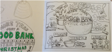
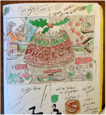
So yes, this is a recycled topic and a recycled comic. To be honest, I'd planned to re-draw it better, as this was only a quick rough sketch, but thought it would be fun to see how it looked in colour instead.

See George Monbiot's excellent comment on the real consequences of buying junk because you think you just have to buy something:

"There’s nothing they need, nothing they don’t own already, nothing they even want. So you buy them a solar-powered waving queen; a belly button brush; a silver-plated ice cream tub holder; a “hilarious” inflatable zimmer frame; a confection of plastic and electronics called Terry the Swearing Turtle..." see the article here

Three days til Solstice and the beginning of the return of the light... now there's something to celebrate!


​

0 Comments

those two terrible questions that stifle what you do

11/12/2015

0 Comments

 
Picture
The brilliant comic artist/writer/teacher Lynda Barry produced a truly awesome heart-felt recounting of how she finally got to the bottom of the internal struggle that so many of us go through with everything we make.

I'm so happy to have discovered this, some years after she created it, though it makes me sad to know her own enjoyment of her work had been ruined for decades.  

Until she found her answer to those two questions: 


"Is this good?" "Does this suck?"

I won't give away the end, but if you haven't come across this before, and maybe even if you have, you are encouraged to click right here to see it from her own pen ​as no one could say it any better. It's not very long. 

And I hope I can really keep this in mind from now on. Thank you, Lynda. 


​

​

0 Comments

How to have the nicest possible divorce

10/12/2015

0 Comments

 
Picture

​Thankfully this is not something I've had to go through. But I can certainly see that dealing with one of life's most  unpleasant experiences in a way that addresses the difficult negative emotions before trying to agree legal stuff must be a better way!

Jo O'Sullivan is a local lawyer who works in this innovative way, involving the services of a 'family consultant' who interacts with all parties in a number of meetings, making it easier and faster and avoiding having to go to court; in fact that's one of the first things both sides agree on.

Jo wanted a comic-style graphic that would help explain this in a clear, easy-to-understand way. It wasn't one of my quickest, most straightforward jobs with an easy answer - it is, after all, a complex subject. We needed a good few drafts trying out different ways of portraying it, and a bit of trial and error, but in the end doesn't the Collaborative Divorce look like the better choice? 

www.osullivanfamilylaw.com

0 Comments

why use a fountain pen?   part I

9/12/2015

2 Comments

 
The other day, someone asked me about my favourite drawing tools.  Early this year I would've said my best black ink pen was my very old technical pen, my 0.2 old-style Rotring variant, from the late 70s and not made any more. I could draw very fine lines with it. Its point looks like this:
Picture
although that's obviously a 0.3 in the photo. The plastic cartridge is pulled off and filled with ink from a bottle, and the line drawn is perfectly even and precise. Some might find all the maintenance to be a nuisance - they needed washing and reassembling if the ink dried out in the tip - but I always got a geeky pleasure from dealing with the mechanics of it. One disadvantage is that handwriting doesn't come out very natural-looking, having to be done a little too slowly to keep the ink flow going. So sometimes I would use an ordinary artist's fine line pen such as Staedtler instead, but as they start running out of ink, the black gets lighter and at a certain point they have to be replaced. But when, exactly? I hated the waste, but also the faded lines.

Then I somehow - can't remember why or how - came across a website that changed everything.

Someone was comparing two budget models of a type of pen I didn't even know existed: a flexible-nib fountain pen, with which line weight gets much wider with increased pressure! 

By the end of the article I was determined I had to buy one.  

I needed to order from the states, but even with postage it was quite inexpensive and came quickly.  And I was not disappointed. Instead of slow clinically accurate lines, I could make variations in thickness to imply shadow, and could write at natural handwriting speed, and could emphasise certain words. 

It's taken some learning to get used to the drying speed of the waterproof ink I use - which is SLOOOOW - and stop smudging it quite so much.  There is sitll much experimenting with different inks to be done. But I love the look and the feel, and the fact I have to operate its little piston to pull ink into it from a bottle, and it's such a lot of fun to draw with.  

Want to know more?  This is the one I bought: 

2 Comments

hand-lettering a band poster

9/12/2015

2 Comments

 
Ever since I was little kid, I've loved interesting typefaces, labeling my brown paper lunchbag with different letterforms. Who remembers the days of Letraset when if you needed fancy text, you rubbed off individual characters onto cards, flyers, etc?

Now, of course, we all have hundreds at our disposal. But I've discovered there's a move back to hand-drawn lettering, often making use of spaces in custom ways you just couldn't do with a computer font. 

My friend's band in Cumbria wanted a logo which would also serve as a gig poster. With "Moonshine" in the band name,  JC  had in mind a Mason jar, and in keeping with the very, um, homemade quality of that product I figured it had to be written on a simple white label pasted on the side
Picture
We wanted the lettering to  stand out, so I looked for typefaces to fit the idea she had in mind, copied out a few of the important letters that would be needed,  and she chose no.4.  Of course!

Picture
Then came a lot of trial and error through a lot of drafts, getting the size and placement for the right emphasis of the words. I needed to save enough room for the figures, so 'band' had to steal some space from 'moonshine', for example, but without making the latter small.  To have the 'JC' as large as possible in the space, I let it gently overlap onto the word below, which stayed legible because of the different colouring in the top and bottom of the letters.  I'd really wanted to use an ampersand - &- in the top line, because I like them and it seemed most appropriate, but it simply wouldn't fit well, being squashed up against the 'the' and leaving a big awkward gap after the 'JC'.  So spelling it out was a last-minute decision but I was happy with how it curved over the 'S' below - which itself is a representation of an f-hole from a fiddle, which my friend plays in the band. 

And in the spirit of keeping it all looking informal and homemade, I did no measuring to plan the space, and allowed a little natural wonkiness to happen. Which is often the way I work. The trick is trying to keep on the right side of the balance between hand-drawn and just plain messy!
2 Comments

making a food bank appeal

8/12/2015

4 Comments

 
Picture
There's a small charity in town, run by and for people with disabilities, which I've been involved with a little over the past few years. For one thing, I'd have lunch every Wednesday at their pop-up community cafe which provides their members with work experience in cooking, serving, operating the till, etc. And I've hosted an art table there for a while, for anyone who wanted to come do some drawing or painting. 

So when I was asked to create a fundraising ad to appear in our town mag, Viva Lewes, which goes free to many thousands of people, I was delighted to say yes.

It had to be half of an A5 page, and be somehow Christmassy for the December issue (which is out now, of course) and be foodbank-focused. Other than that it was up to me,  although they did want it hand-drawn, including all the wording, to stand out from the rest.  

My first thought was to show some cooking with ingredients flying about in a slightly crazy manner, and to very simply represent the current foodbank-related projects.

I drafted the text "more than just a food bank", and the website for donations, onto a tree ornament which would go in the centre. I thought green lettering on a bright red bauble would be eye-catching. 
Picture
Picture
The rough sketches were happily approved. But I suddenly realised that a red circle in the centre of a white rectangle would look like.... the flag of Japan! Nothing wrong with Japanese flags, but not exactly what we needed here. 

Someone suggested a Christmas pudding instead to hold the wording. It was harder to get the text to fit nice and legibly onto this shape, and as this was in fact the whole point of the exercise, I kept making the pudding base broader until it worked. 

I thought about using a limited colour palette instead of full-colour, and as brown would now be included I took an earlier draft and tried a lighter shade for the background. It was just too dull.  Just to make sure, I experimented with a blue background, which seemed somehow too sky-like, and an orange background, which just didn't make any sense at all. 

So in the end, I did keep to only red and green and pudding-brown, using darker and lighter shades of each, and leaving as much white as was reasonable, for brightness. In the interests of the "hand-drawn" look it was all done by eye, no rulers or measuring involved but if I were to do it again, I would be a lot more accurate with the lettering!  

Last I heard, the fundraising was going well, on the way toward the target, and I'm happy to have played a part in that. 

4 Comments

A Christmas treat for you

7/12/2015

0 Comments

 
Picture
The two good things this time of year are, in my personal opinion a) getting to sing beautiful obscure old unusual Sussex and Sheffield carols in multi-part harmony with various nice groups of people, and b) German spice biscuits. I've been lucky enough to do loads of the singing already, and now it's time to get out the mixing bowl and start baking. 

This is a recipe I came across a few years ago in a newspaper and, well, to be honest... it was a bit of a faff, what with letting the icing drip and dry. But they were so delicious and proved very popular - completely worth the trouble. I'm not normally very keen on sugar or refined carbs, so these are just a complete indulgence once a year!

As is my way, I naturally sketched out the recipe in graphic form to make it easy to follow for myself, then posted it here a couple of years ago, and even printed it as a postcard. 

Today I decided to make it look more festive with colour. And you can download it below. Enjoy! 

Click here to download pdf
0 Comments
    Click to see: What am I doing right NOW?
    ​
    ===================​

    ​
    ​Note: Two Shillings per Day graphic novel-related posts now appear over here on their own page. 

    Picture

    Categories

    All
    Advertising
    Art Trail
    Billboard
    Book
    Business Cards
    Camping
    Challenges
    Children
    Classes & Workshops
    Comics
    Cycling
    Food
    Graphic Novel
    Health
    History
    Hourly Comic Day
    Inktober
    Ireland
    Launch
    Magazine
    Mobile Phones
    Music
    Newspaper
    Postcards
    Radio
    Recipes
    Review
    Sketchnotes
    Tea Towels
    Theatre
    The Guardian
    Tools
    Two Shillings Per Day
    Window

    Archives

    February 2018
    November 2017
    October 2017
    June 2017
    April 2017
    February 2017
    January 2017
    November 2016
    October 2016
    August 2016
    July 2016
    June 2016
    February 2016
    January 2016
    December 2015
    November 2015
    October 2015
    August 2015
    July 2015
    June 2015
    May 2015
    April 2015
    March 2015
    February 2015
    January 2015
    December 2014
    November 2014
    October 2014
    August 2014
    July 2014
    June 2014
    March 2014
    February 2014
    December 2013
    November 2013
    October 2013
    September 2013
    August 2013


Michi Mathias     illustration & comics    

Picture