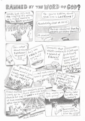
There's a small charity in town, run by and for people with disabilities, which I've been involved with a little over the past few years. For one thing, I'd have lunch every Wednesday at their pop-up community cafe which provides their members with work experience in cooking, serving, operating the till, etc. And I've hosted an art table there for a while, for anyone who wanted to come do some drawing or painting.
So when I was asked to create a fundraising ad to appear in our town mag, Viva Lewes, which goes free to many thousands of people, I was delighted to say yes.
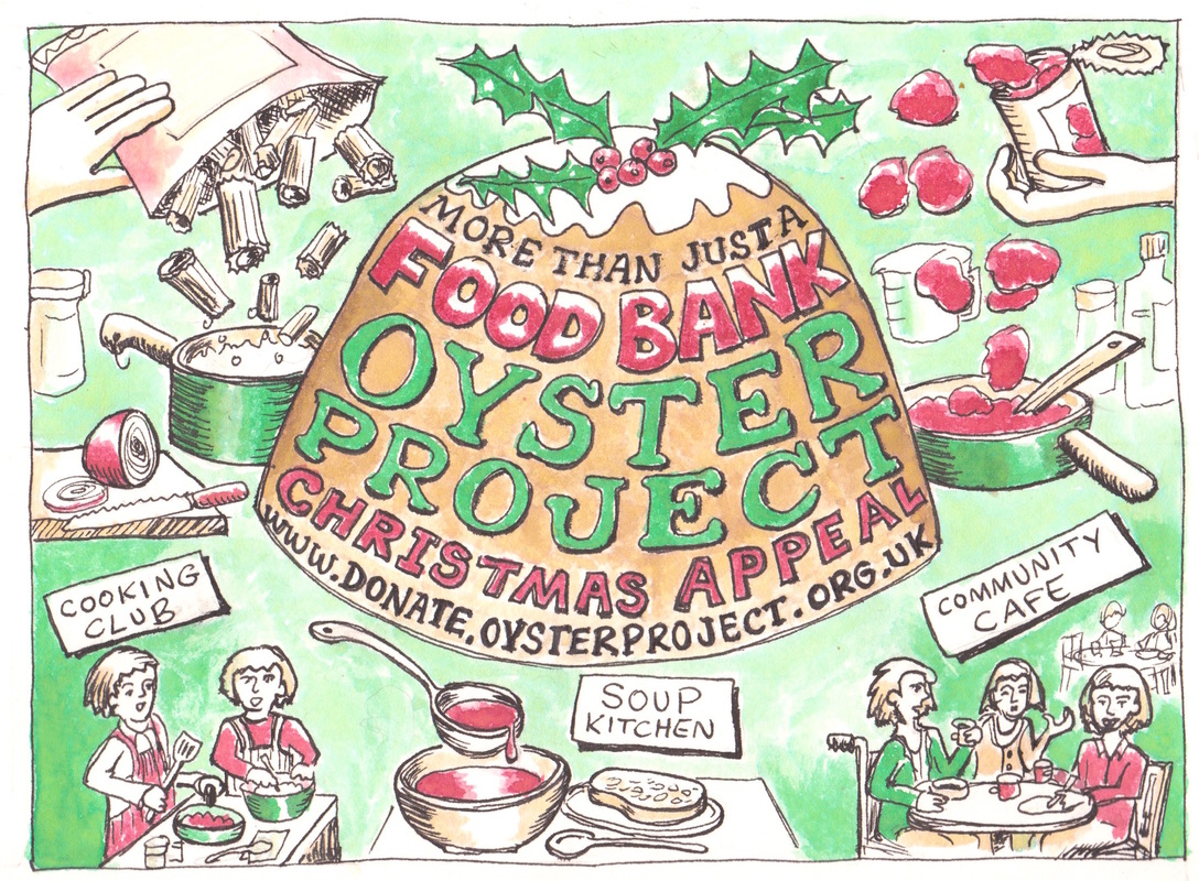
It had to be half of an A5 page, and be somehow Christmassy for the December issue (which is out now, of course) and be foodbank-focused. Other than that it was up to me, although they did want it hand-drawn, including all the wording, to stand out from the rest.
So when I was asked to create a fundraising ad to appear in our town mag, Viva Lewes, which goes free to many thousands of people, I was delighted to say yes.
It had to be half of an A5 page, and be somehow Christmassy for the December issue (which is out now, of course) and be foodbank-focused. Other than that it was up to me, although they did want it hand-drawn, including all the wording, to stand out from the rest.
| My first thought was to show some cooking with ingredients flying about in a slightly crazy manner, and to very simply represent the current foodbank-related projects. I drafted the text "more than just a food bank", and the website for donations, onto a tree ornament which would go in the centre. I thought green lettering on a bright red bauble would be eye-catching. | 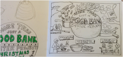 |
The rough sketches were happily approved. But I suddenly realised that a red circle in the centre of a white rectangle would look like.... the flag of Japan! Nothing wrong with Japanese flags, but not exactly what we needed here.
Someone suggested a Christmas pudding instead to hold the wording. It was harder to get the text to fit nice and legibly onto this shape, and as this was in fact the whole point of the exercise, I kept making the pudding base broader until it worked.
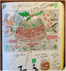
I thought about using a limited colour palette instead of full-colour, and as brown would now be included I took an earlier draft and tried a lighter shade for the background. It was just too dull. Just to make sure, I experimented with a blue background, which seemed somehow too sky-like, and an orange background, which just didn't make any sense at all.
So in the end, I did keep to only red and green and pudding-brown, using darker and lighter shades of each, and leaving as much white as was reasonable, for brightness. In the interests of the "hand-drawn" look it was all done by eye, no rulers or measuring involved but if I were to do it again, I would be a lot more accurate with the lettering!
Last I heard, the fundraising was going well, on the way toward the target, and I'm happy to have played a part in that.
Someone suggested a Christmas pudding instead to hold the wording. It was harder to get the text to fit nice and legibly onto this shape, and as this was in fact the whole point of the exercise, I kept making the pudding base broader until it worked.
I thought about using a limited colour palette instead of full-colour, and as brown would now be included I took an earlier draft and tried a lighter shade for the background. It was just too dull. Just to make sure, I experimented with a blue background, which seemed somehow too sky-like, and an orange background, which just didn't make any sense at all.
So in the end, I did keep to only red and green and pudding-brown, using darker and lighter shades of each, and leaving as much white as was reasonable, for brightness. In the interests of the "hand-drawn" look it was all done by eye, no rulers or measuring involved but if I were to do it again, I would be a lot more accurate with the lettering!
Last I heard, the fundraising was going well, on the way toward the target, and I'm happy to have played a part in that.