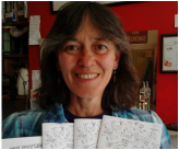
| Ever since I was little kid, I've loved interesting typefaces, labeling my brown paper lunchbag with different letterforms. Who remembers the days of Letraset when if you needed fancy text, you rubbed off individual characters onto cards, flyers, etc? Now, of course, we all have hundreds at our disposal. But I've discovered there's a move back to hand-drawn lettering, often making use of spaces in custom ways you just couldn't do with a computer font. My friend's band in Cumbria wanted a logo which would also serve as a gig poster. With "Moonshine" in the band name, JC had in mind a Mason jar, and in keeping with the very, um, homemade quality of that product I figured it had to be written on a simple white label pasted on the side 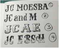 We wanted the lettering to stand out, so I looked for typefaces to fit the idea she had in mind, copied out a few of the important letters that would be needed, and she chose no.4. Of course! | 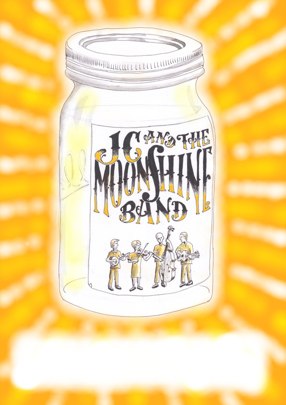 |
Then came a lot of trial and error through a lot of drafts, getting the size and placement for the right emphasis of the words. I needed to save enough room for the figures, so 'band' had to steal some space from 'moonshine', for example, but without making the latter small. To have the 'JC' as large as possible in the space, I let it gently overlap onto the word below, which stayed legible because of the different colouring in the top and bottom of the letters. I'd really wanted to use an ampersand - &- in the top line, because I like them and it seemed most appropriate, but it simply wouldn't fit well, being squashed up against the 'the' and leaving a big awkward gap after the 'JC'. So spelling it out was a last-minute decision but I was happy with how it curved over the 'S' below - which itself is a representation of an f-hole from a fiddle, which my friend plays in the band.
And in the spirit of keeping it all looking informal and homemade, I did no measuring to plan the space, and allowed a little natural wonkiness to happen. Which is often the way I work. The trick is trying to keep on the right side of the balance between hand-drawn and just plain messy!
And in the spirit of keeping it all looking informal and homemade, I did no measuring to plan the space, and allowed a little natural wonkiness to happen. Which is often the way I work. The trick is trying to keep on the right side of the balance between hand-drawn and just plain messy!