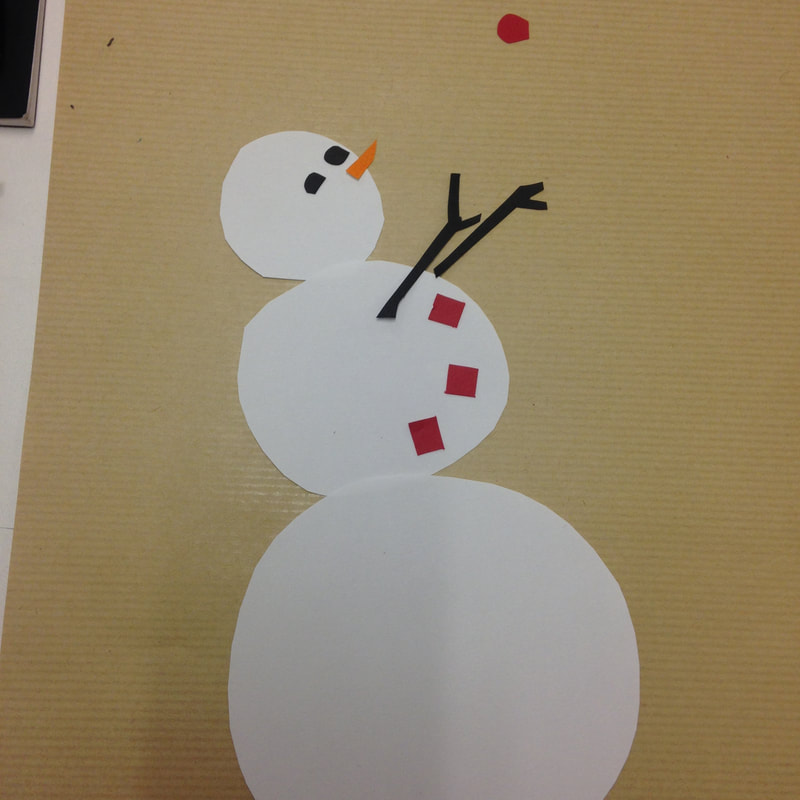
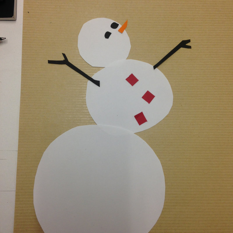
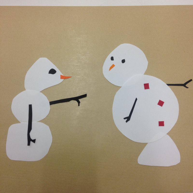
Finally we had to place these characters against a background scene in a way to express something about the newly created character. Alexis showed us some elements of background composition which included:
- leaving empty space for certain effects
- directing characters' gaze toward other characters or something of note, guiding the viewer's eye
- separation or overlapping unification of silhouettes indicating relationships between characters
- visual links by echoing colour or shape, grouping elements through use of shared colour pallette
- reader's viewpoint - from character's eyes, or cinematic overhead distance shot near ending...
These notes are pretty sketchy and some of the concepts probably too subtle for what I do but it was fascinating to learn about how much is going on, probably at a subconscious level, when looking at a beautifully made graphic novel. Alexis was very clear in his explanations, truly an excellent teacher.
And I think I might even try a bit of collage in planning some panels for my graphic novel Two Shillings per Day. Anything that can help add variety to the look of four people cycling along country roads has got to be good!
